
Mastering SwiftUI Gauge: Create Custom Gauges in iOS 16
Software developer documenting my journey through web and mobile development. I share what I learn, build, and struggle with—from React to SwiftUI, architecture decisions to deployment challenges. Not an expert, just passionate about coding and learning in public. Join me as I navigate the tech landscape one commit at a time.
SwiftUI includes a new view named Gauge for displaying progress in iOS 16. It is used to display values inside a range. Let's look at how to use the Gauge view and deal with different gauge styles in this tutorial. But first let's take a look at Apple's official definition for the Gauge view.
A gauge is a view that shows a current level of a value in relation to a specified finite capacity, very much like a fuel gauge in an automobile. Gauge displays are configurable; they can show any combination of the gauge’s current value, the range the gauge can display, and a label describing the purpose of the gauge itself. Apple Developper documentation
Simplest Gauge
The simplest way to use the Gauge view is to pass a value to the init method. In it's most basic form, the value of the gauge is in 0.0 to 1.0 range.
// Most basic usage of the Gauge view
struct ContentView: View {
    var body: some View {
        Gauge(value: 0.5) {
            Text("Gauge")
        }
    }
}

Gauge with a range
You can also make the Gauge view display a value as a percentage of a range. The value must be between the range's minimum and maximum values. The Gauge view will display the value as a percentage of the range.
// Gauge view displaying a value as a percentage of a range
struct ContentView: View {
    var body: some View {
        Gauge(value: 25, in: 0...100) {
            Text("25% Gauge")
        }
    }
}

Gauge styles
You can customize the Gauge view by passing a GaugeStyle to the gaugeStyle modifier. The GaugeStyle protocol defines the appearance of the Gauge view. There are two default styles provided by SwiftUI: LinearGaugeStyle and RadialGaugeStyle. The available gaugeStyles are:
.accessoryCircularCapacity.accessoryCircular.accessoryLinearCapacity.accessoryLinear.linearCapacity.automatic
// Gauge view displaying a value as a percentage of a range
    struct ContentView: View {
        var body: some View {
            Gauge(value: 25, in: 0...100) {
                Text("25% Gauge")
            }
        }
    }

Custom Gauge style
You can also create your own custom gauge style by conforming to the GaugeStyle protocol. The GaugeStyle protocol defines the appearance of the Gauge view.
// Custom GaugeStyle
struct CustomGaugeStyle: GaugeStyle {
    func makeBody(configuration: GaugeStyleConfiguration) -> some View {
        ZStack {
            Circle()
                .stroke(Color.gray, lineWidth: 10)
                .frame(width: 100, height: 100)
            Circle()
                .trim(from: 0, to: CGFloat(configuration.value))
                .stroke(Color.blue, lineWidth: 10)
                .frame(width: 100, height: 100)
                .rotationEffect(Angle(degrees: -90))
            Text("\(Int(configuration.value * 100))%")
                .font(.title)
        }
    }
}

// Custom GaugeStyle usage
struct ContentView: View {
    var body: some View {
        Gauge(value: 0.5) {
            Text("Gauge")
        }
        .gaugeStyle(CustomGaugeStyle())
    }
}

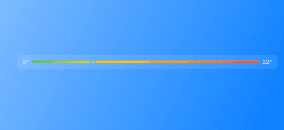
Our Temperature Gauge
And finally let's make a nice looking temperature gauge. We will use the accessoryLinear gauge style and a nice gradient tint modifier.
struct TemperatureGaugeView: View {
    private var min: Double = 7.0
    private var max: Double = 22.6
    private var current: Double = 12.6
    var body: some View {
        Gauge(value: current, in: min...max) {
            Text("Tinted Gauge")
        }
        currentValueLabel: {
            Text("\(Int(current))°")
        }
        minimumValueLabel: {
            Text("\(Int(min))°")
        } maximumValueLabel: {
            Text("\(Int(max))°")
        }
            .tint(Gradient(colors: [.green, .yellow, .orange, .red]))
            .gaugeStyle(.accessoryLinear)
    }
}

Conclusion
I hope this tutorial helped you understand how to use the Gauge view in SwiftUI. If you have any questions, please send me a little message, I will be happy to help you. If you liked this tutorial, please share it with your friends. Thank you for reading!